hello. my name is
ALISIIA KOROL
A fresh-out-of-the-oven graphic designer with love for branding, fun typography and graphic, unique illustrations to make your brand stand out on the market. There is nothing more fascinating to me than transferring ideas from my mind directly to paper or screens.
Corporate Identity
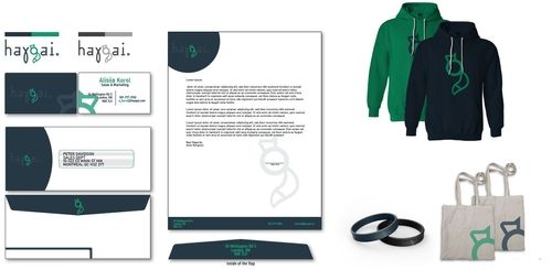
The objective was to create an identity for an apparel company, including, but not limited to, stationery (business cards, envelopes, letterhead), and merch.
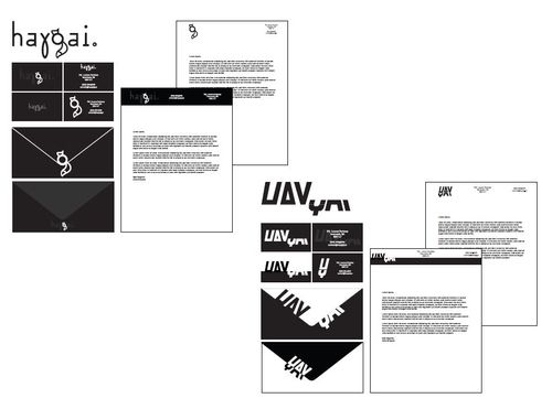
The idea to use fox and green colors came from my name in my native languages, Ukrainian and Russian. The “lis” part in Russian means “fox,” while in Ukrainian it translates to “forest.” The name itself was generated randomly, as I didn’t want to use any specific word for the company. In my mind, it had to be something unique and new, but also relatively simple that people would remember. The second concept, that I ended up not using, was inspired by sports companies. It was intended to look like one of them, while also fitting in with the modern, appealing look, but the fox looked more attractive to the eye.
Label Design
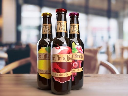
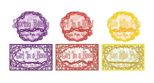
The objective was to create a unique custom logo and three beer label designs for a fictional Ontario brewing company.
From the start I wanted to make something that would visually remind consumers of the old fairy tale books, with muted colors and worn out look. At first thorny veins looked most appealing to me, as they connected, in my mind, to the old book covers and frames. But as I went further and tried putting them on the bottles, they looked busy and unappealing. The final look looks drastically different - posterized fruit, - but still has that same energy and vibes that I initially went for, even more so translating my first idea, at the same time remaining bold, unique and attention-grabbing.
Direct Mail
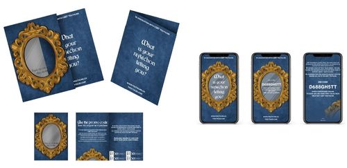
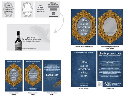
For this one, the goal was to create direct mail piece and online promo designs for a fictional Ontario brewing company, Tipsy Tales.
The idea and overall concept here remained close to what it was originally - old tales, nostalgic energy, at the same time being attention grabbing enough to be remembered and not thrown away after being received. The “envelope” would have a cut-out opening on the front, and, upon taking out the card, you will see that the inside is made from mirrorlike paper. The text would say “Save up on drinks this month...” and the card that was taken out before would contain all the details for how exactly you will be able to save up, and what charity the money will go to.
Magazine Ads
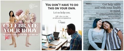
For this project, we had to create three magazine ads for magazine of our own creation, additionally coming up with simplistic logos.
The whole magazine, UMBRA, was created, assembled and put together for a big project. Everything we put inside was supposed to come from us, including the ads. In total we had to make three, related to the general theme of the magazine. For Carnations Customs, I went with the flower carnation because it resembles pride - the idea behind it was that, as it’s an underwear company, you should hold pride in your body. “Qonnect” in QONNECT YOUTHLINE was a mix of “queer” and “connect,” as it’s a support line for queer people in need. PRIDE INC had the same message, while also referring to feeling proud due to being able to help.
Magazine Spreads
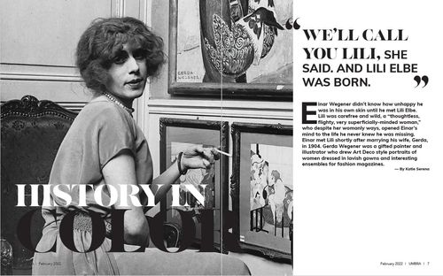
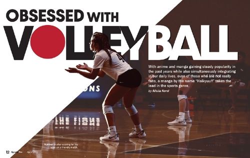
Objective for this one was to design unique magazine spreads.
These are different spreads taken from different projects that I worked on, all made for cover stories. In all of them, I tried to use bold, visually appealing fonts that would remain readable while also drawing and catching reader’s attention.
Promotion Campaign
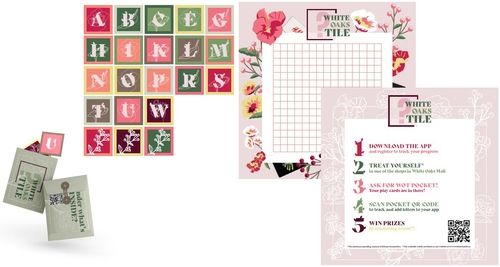
This project challenged us to come up with a promotional strategy in a form of a game to increase foot traffic in the White Oaks Mall.
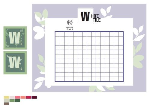
As it was a group project, the tasks were divided between three people. Mine was to create the main elements for our game of choice(based on scrabble).Our theme of choice was spring, but I didn’t want to use too many pinks and reds, as that would have a “feminine” look, while our game had to attract all people. I still stuck with flowers as our main graphic components, and used them throughout all the other elements. The pouch in which customers would receive their playable cards would be green, to stray away from pinks.
Custom Typeface
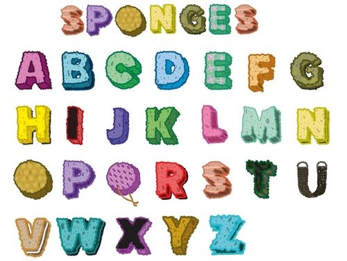
Here, we had to come up with a custom typeface.
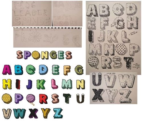
I wanted to create something that would look fun and unique, and went through several ideas - flowers, bandaids, shoes, doors, and even frogs on the first stages. But out of all of them, I decided to proceed with sponges, as they were easy to manipulate and came in all forms and shapes. I went through as many sponges as possible, from the cleaning ones to those we use on our bodies. Some of them I wanted to look old, very much used, to add more interest. The holes on the final designs were, unsurprisingly, inspired by Spongebob, same as thicker stroke that is close in color to the main part. It makes the letters look cartoonish, but also softer and easier on the eye.
